
Using colour psychology to help decorate your home
Colour psychology is the emotional effect certain colours have on our subconscious mind. Using colour psychology you can get the most out of your decorating to give each room just the right atmosphere and functionality.
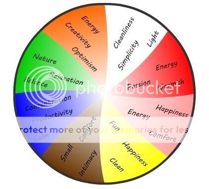
Red: is the colour of passion, energy and warmth. Red is commonly used in the dining room as it can help create appetite. Darker reds can be used in the master bedroom of young couples as it can create an intimate and warm effect in a room. Red however is notorious for going against concentration so shouldn’t be used in study areas as this can lower productivity.
Blue: is the opposite of red and is commonly associated with calm, concentration and productivity. Blue is often used in home offices or study areas as it helps promote a good working environment through concentration. Blue is also commonly used in boys’ bedrooms as it is a colour often popular with young males.
Green: is the colour of nature and is often associated with relaxation and balance. Green is mainly used in bedrooms with lots of natural light and also commonly features in spare rooms left over for meditation, yoga and other spiritual activities. Green is a great colour to use when combined with plants to create a calming natural feel.
Pink: is the colour of happiness, energy and comfort. Pink is most commonly used in young girls’ bedrooms as it is seen as a highly feminine colour. Pink works great for bedrooms as it helps create a comforting happy environment.
Brown: is the colour of comfort, intimacy and closeness. Brown like many other dark colours absorbs a lot of light which can make rooms seem smaller than they actually are. Brown is often used in bedrooms to create a comforting and intimate environment.
White: is the colour of cleanliness, simplicity and light. White is most commonly used in bathrooms and kitchens to give the room a clean sterile feeling. White also helps when cleaning as you can notice dirt more easily. White reflects the most light possible, meaning that rooms can look larger than they actually are. The only problem with pure white is that it can be hard on the eyes so off-shades are often used when decorating your home.
Orange: is the colour of energy, creativity and optimism. Orange is often used in the living room or dining room as like red it can help create appetite. Orange has also been linked to creativity so can be great in a child’s play room.
Yellow: is the colour of fun, happiness and cleanliness. Similar to white, if yellow is used in too bright a shade it can be hard on the eyes. Yellow also helps a room to look large and works well with lots of natural light. Yellow is often used in bathrooms or the kitchen as it promotes a clean fresh image.
Comments